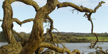
cover gallery
"Cruzamento" by Marcio Toledo
jenett.webthings - an independent web initiative Experimental Magazine the dailywebthing We Belong Here - Creative Behavior Collective
 
search for any or all words/phrases
phrases in "quotes" • upper-case is case-sensitive
linkdup    SHIFT|Japan   preshaa.com

ASAP!   A Stand Against Pop-under ads!
Validated XHTML 1.0  Validated CSS  AORTAL - the anti-portal

Firefox Browser


site reviews
10/07  : :  09/07  : :  08/07  : :  07/07  : :  06/07  : :  05/07  : :  04/07  : :  03/07  : :  02/07  : :  01/07  : :  12/06  : :  11/06  : :  10/06  : :  09/06  : :  08/06  : :  07/06  : :  06/06  : :  05/06  : :  04/06  : :  03/06  : :  02/06  : :  01/06  : :  12/05  : :  11/05  : :  10/05  : :  09/05  : :  08/05  : :  07/05  : :  06/05  : :  05/05  : :  04/05  : :  03/05  : :  02/05  : :  01/05  : :  12/04  : :  11/04  : :  10/04  : :  09/04  : :  08/04  : :  07/04  : :  06/04  : :  05/04  : :  04/04  : :  03/04  : :  02/04  : :  01/04  : :  12/03  : :  11/03  : :  10/03  : :  09/03  : :  08/03  : :  07/03  : :  06/03  : :  05/03  : :  04/03  : :  03/03  : :  02/03  : :  01/03  : :  12/02  : :  11/02  : :  10/02  : :  09/02  : :  08/02  : :  07/02  : :  06/02  : :  05/02  : :  04/02  : :  03/02  : :  02/02  : :  01/02  : :  12/01  : :  11/01  : :  10/01  : :  09/01  : :  08/01  : :  07/01  : :  06/01  : :  05/01  : :  04/01  : :  03/01  : :  02/01  : :  01/01  : :  12/00  : :  11/00  : :  10/00  : :  09/00  : :  08/00  : :  07/00  : :  06/00  : :  05/00  : :  04/00  : :  03/00  : :  02/00  : :  01/00  : :  12/99  : :  11/99  : :  10/99  : :  09/99
prior listings

Please note: Our format changed as of 10/18/07 – see the front page and full archives for more recent listings. Thanks.


  • d*kids 2/28/02 
    Description: cool collective of talented people
    Comments: They call themselves "kids" though they range in age from 7,129-days-old to 11,433-days-old.  Since my own age is slightly more than the total of the youngest and oldest, and I also like to think of myself as a kid, I'm takin' the safe route by saying they are all kids.  After all, I'm the guy who really believes the web is ageless ;-)...

    Today's pick is a collective, or community of 8 talented designers that's still in the process of determining its "true nature and purpose."  For now, "it's merely an outlet for news, projects, photography and information."  As a user, I think it's an excellent window to the cool work of 8 talented designers – great covers plus photography and Flash projects and a site design that rocks – "mmm, little gray boxes."  The kids are all pretty busy, some still in school, some busy with their own sites and projects, but the mix of work shared here is well worth checking out.  I'm thinkin' this site has great potential as an ongoing design mag (since it already appears to be an excellent one)...
     
  • ONYROS 2/26/02 
    Description: Dreams... (Flash)
    Comments: Could it be that Morpheus is a fictional character that represents the crew behind today's pick?  "That they are I" is the English translation of the phrase below his name next to his conspicuously missing picture. "The crew it is born from a common plan."  [Yesterday's pick apparently does have radar that reached Morpheus and prompted the site submission, keeping us in the realm of Italian web design for a second day.  Today's pick is a world of dreams born last December, now sharing over a dozen Flash pieces from the collective creative spirit of Cricci, Frank, and Murdock.  "Lady of the Lake" will charm you while "Hardskin's Awakening" will remind you of the price paid for "amusing nights."  The theme of water as a kind of soft escape or peaceful place appears in several of the pieces done during its first month.  Not-so-peaceful themes appear in a piece done this month called "The Surgery."  Powerful imagery and dreamy soundscapes – if we're lucky, Morpheus may be spawning yet another new dream soon...
     
  • Design(Radar 2/25/02 
    Description: Italian e-zine features web art and design links, news, site reviews, and articles
    Comments: It's funny.  I've been visiting the site several times a week for the longest time and though it's all in Italian, that really hasn't stopped me from enjoying it.  Today's pick features a wealth of links to great art and design sites, along with short reviews/descriptions – I guess I've been ignoring the latter, just clicking away and exploring the featured sites.  So, I spent some time early this morning using my favorite translator to check out today's pick more thoroughly.  How enlightening!  The concise descriptions and accompanying screenshots are done well, giving the user a nice glimpse of the sites – I like the columnar layout, too.  One of the "special" articles ("The Art of H.R. Giger") is quite interesting.  Another article about the "thin line" between being inspired by another designer and copying another designers' work is thought-provoking and relevant, especially in the world of web design.  Aside from the growing "links" directory, there's also a section that focuses on sites "made in Italy."  An excellent site design with great graphics, today's pick makes a nice "starting point" – explore the web...
     
  • mon amour 2/24/02 
    Description: a collection of visual art
    Comments: It's not easy keeping the mix interesting around here.  I know people don't wanna see a Flash site every day, nor is everybody interested in an endless stream of sites by designers who only design for other designers.  Sometimes, you need a change.  Sometimes, you need to go back to zero, back to basics, back to simplicity.  I bumped into today's pick at preshaa (one of my favorite minimalistic designs) and when I saw that the opening graphic ("Fire") was an animated .gif, that certainly got my attention.  Though the big image will take a few moments to load on a dialup connection, it is impressive that the animation was done the old-fashioned way – you just don't see many animated .gifs anymore.  There's 18 different pieces in this simple presentation, mostly static pieces with a unique sense of style – cute little rollover graphics, too...
     
  • Locus Novus 2/23/02 
    Description: a venue for collaborative works by contemporary short fiction writers, graphic designers and visual artists (Flash)
    Comments: An interesting collaborative space with almost a dozen content contributors so far, today's pick is "a synthesis of text and image... built as an alternative for the traditional presentation systems."  I read a number of interesting pieces and have to say that the content is thought provoking – well-written texts accompanyed by excellent visuals.  As a user, though, I found the site to be somewhat challenging – I think that's what the site's creator had in mind, calling it "a device to question the conventional methods of perception."  In my mind, some of the pieces raise questions aside from the meanings of their textual content.  Does the user want to read one line at a time and wait 5 or more seconds for the next line to appear?  How many text effects and transitions can the user bear in one sitting?  Are long lines of text in a spiral formation meant to be read?  Are you making me click a little too much?  Don't get me wrong – these are just my observations and questions based on what I'm used to  I guess that's the point.  The "zone to examine the cognitive chaos" has done it's job well...
     
  • Mr. Wong 2/17/02 
    Description: the pixel grower
    Comments: Born February 6, 2002 – not Mr. Wong, but his site.  The announcement bills it as "another weird, pixelated project!"  And he calls himself "the pixel grower."  We got pixels today, baby – more pixels in the portal cool zone, not to mention all the site reviews where I shared my enthusiam with y'all about how I've been collecting sites with "pixels" in the site's name or description – yeah, I know – I'm silly!  But Mr. Wong really is about pixels, from the naughty little graphic at the top of his main page to all those "new breedings" shown along the bottom – an obvious master of icons.  There's only one piece in the "worx" section, but give Mr. Wong a break 'cause his site is only 11 days old and he is kinda busy at the moment, as the head graphic implies (hehe).  The work is a sign of the times for many designers.  It's hard to have given something your all, only to be left fired and hungry... the short text on the work says it all, plus the visual aspect is, if I may use one of Mr. Wong's special phrases, "pixolutely perfect."  Okay – so the site is a little light on content and I almost didn't choose it.  Then I saw the words "my other site" and realized that Mr. Wong's art is more extensive than I originally thought – even more pixels plus a cool non-Flash animation.  I like today's pick – think I'll go reload the splash page a few more times...
     
  • Markus Daum Gallery 2/15/02 
    Description: original, colorful artworks make tasty email postcards...
    Comments: The artworks are colorful and abstract and the gallery currently has 20 pieces in it.  The usual criteria are met – nice site design, easy navigablility, original content, blah, blah, blah.  The bonus is that any of the works can be the basis of a postcard you send by email – not exactly a new concept, I know, but if someone sent me one of these tasty visuals, I'd sure appreciate it.  I ran the thing through a test and the end product was pretty cool.  The site's all in German, but if you're not multilingual in that direction, that's okay 'cause these images just might speak your language anyway.  So – go tell someone to have a great weekend and brighten up their day with a piece of Markus' art at the same time... 
     
  • tiger 2/14/02 
    Description: online visual magazine since December, 2000 (Flash) (mature content)
    Comments: The quality of the visuals and the way they're presented is superb.  Today's pick is an online magazine that's been around since December, 2000 and the current issue is #18 (all previous issues are archived).  In a day when advertising tactics have gone a little crazy on the web, it's refreshing to see a model that blends the advertising spots into the content in such a low-key way (without hiding it) – it's an approach that doesn't invade the user and I'm willing to bet it's considerably more effective than those obnoxious pop-unders and other downright devious approaches we've been putting up with lately.  Each issue is full of great visual content (some of it obviously intended for a mature audience) and the site has the look and feel of an actual magazine.  Many talented artists have contributed to the content and as far as online mags go, this is one of the best I've seen yet...
     
  • omie.ru 2/12/02 
    Description: the strange city is open (Flash)
    Comments: Today's pick is a "strange city" of illustration and art from a Russian designer named Omie.  I like the small imprint of the main page, about the size of an index card, centered in the window – two simple news windows with an animated interface below, all done in Flash.  Omie's illustrations seem quite simple and somewhat primitive at first, but as you view them, you realize just how talented he is.  His caricature of Tom Waits is a good example of what I'm thinking – it seems to capture the personality of the subject.  Another piece called "reinkarnation" appears to be just a doll's head in the corner, but the expression on the face combined with mental images that the name invoked as I viewed it made for a unique, and I'm sure a totally subjective, perception of it.  Omie seems to be quite interested in the visual flavor of dolls – another stand-alone site, The City of lost... dolls, has three simple pieces which I really liked.  Omie's a photographer, too, and his around omie site has about three dozen photos, plus a cool cover done by his friend snus.  Creative stuff!
     
  • kilfish 2/8/02 
    Description: pictures, flash movies and splash pages in dark (Flash)
    Comments: Somewhere in Budapest, an artist/designer named "kilfish" is busy capturing the images and voices within.  Capturing them is one thing, but expressing them through one's art is quite another.  Kilfish has it down.  Why am I not surprised that cmart is one of the many that has inspired Kilfish?  "Every year pricks a sore on my skin... each month pulls me further down the spiral."  Entering the site is a trip into darkness that requires "patience, tolerance, [and a] sense of humour."  In one image, a thin, sick-looking man appears to be trapped within what looks like a syringe – "no alarms and no surprises."  In another, Kilfish lies dead, "waiting for the judgement" with a convienient mailto link for the Lord to use.  My favorite has to be the café setting with the plastic-looking people that says "I wish I had been born on another planet."  For every thousand Flash sites you come across, only one will be like today's pick – extraordinary interface and content within an emotional environment effectively constructed and conveyed by one artist.  Magnificent!
     
  • the xanthic eye 2/7/02 
    Description: online gallery containing free wallpapers, icons, skins, and paint shop pro and photoshop tutorials
    Comments: As designers, one of the things we try to avoid is the appearance of horizontal scrollbars... sometimes.  In the case of today's pick, horizontal scrolling is intentional and the sleek interface, inspired by the look of the iMac ("this one is shiiiiiiny oooOooOo") is quite wide on some of the pages – personally, I think it's worth having to scroll left to right – it's such a cool interface!   Today's pick has been listed in the portal cool zone since May, 2000, but after seeing the current version (V6), it was clear to me that it belongs with the best of the cool.  V6 was launched last September.  There's a wealth of great graphics in the "Gallery" as well as in the "Wallpapers" section.  Add some skins and icons for download plus some tutorials – as far as graphics-type sites go, this one has a lot of good, original content.  Raymond's been on the web since 1999 and – get this – he's only 16-years-old...
     
  • antipixel 2/6/02 
    Description: a weapon of mass distraction
    Comments: I discovered today's pick yesterday when exploring some sites that make their content available via RSS syndication.  Jeremy found a red bowl in a "shop on the way to the station" – "Every once in a while you stumble upon a perfect thing... I've been trying to think of how to describe the qualities of this simple thing."  Jeremy's simple, short entry about the object is probably the the most interesting and thought-provoking thing I read yesterday – and I read a lot.  The site is basically a weblog/journal but it's different than most (i.e., better).  Jeremy writes about a number of different things and I enjoyed browsing by category rather than by month.  From "Computers" to "Photographs" to "Little-known Facts", I found his entries intelligent and his writing style most palatable. Jeremy reads a lot and the "Books" category will definitely fly with the avid readers out there – excellent reviews.  And if you like nature and the thoughts and associations it invokes, check out "The Good" for the "Leaf Week" entries.  With all that said, I've got to say the site's design is what got my attention immediately (besides that red bowl entry).  It's a very clean layout with excellent use of CSS and graphics.  I like the choice between serif or sans-serif fonts, though there appears to be a gliche in IE6 on a PC, after you use the feature to change fonts, that's similar to the problem Jeremy mentioned about the OmniWeb browser back in December – I experienced no problem in NS6 (I guess web standards are still evolving).  Today's pick, from an Australian working in Tokyo, just happens to have "pixel" in its name, too (sweet!), and you know I've been collecting 'em...
     
Copyright 1997-2010 © jenett webthings. Some rights reserved. For mature audiences.